 Read CV


Every song you love has a whole world of people behind it. Most of them you'll never know their name.
company backed by




My Role
Solo Designer — End to End
Surfaces
7 platforms designed
Stack
iOS · Web Widgets · TV
Status
Concept — Unreleased
01 — The Problem
Music credits are buried.
The people who make songs are invisible.
Open Spotify. Play your favourite song. Now try to find out who produced it. Who played bass. Who co-wrote the hook. You might find a songwriter credit buried three taps deep — if you know where to look. Most people don't, and most platforms don't make it easy.
This isn't a minor inconvenience. It's a systemic problem. Producers, session musicians, mixing engineers, and co-writers are the invisible workforce behind every song you love. They have no discovery surface. No profile page a fan can stumble onto. No way for a casual listener to go from "I love this beat" to "who made this beat?"
This is the problem I was brought in to solve. As the designer on this engagement, I was responsible for turning dense, inaccessible music industry metadata into experiences that real people would actually want to explore — across seven different surfaces, each with its own constraints, conventions, and user expectations. The work below covers the full concept: research, flows, and high-fidelity screens I designed and presented to the product team. Not every piece of it made it into the app you can download today, but the thinking and the screens are real design work, done for a real product.
How do you make people care about information they've never even known existed — and do it across seven completely different platforms without forcing a single visual language on any of them?
02 — Who I Was Designing For
Two audiences.
One shared curiosity.
Deepr has two distinct user types — and the design challenge was that they have completely different entry points into the same information.
The Curious Listener
They love music but have never thought about who produced it. They don't know what an ASCAP publisher is. They've never heard the term "session musician." But they're curious — if you show them something interesting, they'll explore it. The design has to create that curiosity, not assume it exists.

The Industry Insider
Producers, engineers, session musicians. They know credits exist — they just can't get discovered through them. For them, Deepr isn't about exploration; it's about visibility. Their work finally has a surface. They need profiles, connections, and the ability to be found.
03 — The Netflix Widget
Invisible until you need it.
Undeniable when you do.
Deepr needed a way to surface music credits while users watch content — without ever leaving the streaming platform. I chose Netflix as the first integration target because of its music-heavy catalogue. The constraint I set for myself was extreme: you cannot interrupt the viewing experience. The widget has to exist within Netflix's interface without looking like it doesn't belong, and it has to add value without demanding attention.
I designed a quiet pill button in the corner of the Netflix player. When tapped, a panel slides in from the right — listing every song in the content, with expandable credits, a QR code to save songs to your phone, and a deliberate sponsored slot (Deepr's B2B revenue model). The panel never covers the video. The user never leaves Netflix.
High Fidelity Prototype of Netflix Widget
 Key Design Decision
The button that belongs in the controls
The "Go Deepr" button sits inside Netflix's native playback controls bar, the same row as play, skip, volume, and fullscreen. It doesn't float on top of the video or interrupt the frame. It's styled as a compact red pill with a small circular icon, sized and weighted to match the surrounding native controls rather than standing out from them. The moment you're curious about a song, the moment you think "what was that track?" — it's right there, exactly where a native Netflix control would be. That restraint was the hardest part of this design.
B2B ModelThe sponsored takeover
This is how Deepr makes money as a B2B product, but I designed the sponsorship to feel like part of the experience, not an ad bolted onto it. When a brand sponsors a title's music panel, the entire panel header becomes theirs: "This Experience Is Sponsored By," their logo, and a full-width lifestyle image that sets the tone before a single song is shown. It's a real estate trade, the brand gets a premium, unmissable placement, and in return the panel underneath stays completely clean. No banner ads wedged between songs, no interruptions mid-scroll. One honest, upfront placement instead of a dozen small annoying ones.
04 — YouTube TV Widget
TV is a louder platform.
The widget had to adapt.
YouTube TV lives on a television, controlled by a remote with a D-pad and a handful of buttons. Every assumption I'd made designing for Netflix had to be rebuilt for a platform where the user can point and click, but can't type, can't pinch-to-zoom, and is sitting eight feet from the screen instead of holding it in their hand.
The entry point sits inside YouTube TV's own playback bar, next to Networks, Episodes, and More to Watch — a "Episode 3 Playlist" control with an eye icon. Selecting it doesn't cover the video; it pillarboxes it down to make room for the panel sliding in from the right, exactly like a native TV app would behave.
High Fidelity Prototype of Youtube TV
Key Design DecisionThe Hide/Show Video toggle
When a song starts playing, its album art expands to fill the space above the playlist — and a "Hide Video" control appears, letting the viewer collapse the show entirely to focus on the music. Tap it again and "Show Video" brings the episode back. On a phone, the video and the credits can coexist in separate panes. On a TV, they're fighting for the same limited real estate, so I gave the viewer the choice instead of deciding for them.
Sponsor RotationThe takeover adapts per session
The same sponsored-takeover pattern from Netflix carries over here — but on TV I designed it to rotate. One session opens with Coca-Cola branding the header and a banner beneath the mini-player; browse into an artist's profile and the sponsor can shift to McDonald's, complete with its own offer banner. The panel's structure stays identical regardless of who's sponsoring it — only the brand assets swap.
Tapping into a song goes one level deeper — "All Musicians Present In The Song" — a stacked list of every contributor and their role: Band, Produced By, Written By. Tapping any of them opens a full profile, with a photo and a short bio, the same "character" treatment as the iOS app. This is where the initials-avatar fallback earns its keep: not every session musician has a profile photo on file, so contributors without one get a clean circular initials badge instead of a broken image or a blank silhouette — visible in the flow as "SK" for a producer named Sonny Kilfoyle.
Solving a TV-Specific ProblemTyping with a remote is painful. So: a QR code.
Saving a playlist is trivial on a phone — tap a button, it's in your library. On TV, there's no keyboard, no sign-in flow that doesn't feel painful with a D-pad. So the "Save This Playlist" action on TV doesn't try to save anything on the TV at all. It generates a QR code with the playlist name and duration, and a simple instruction: "Save the QR code above to open and save this playlist in YouTube." The viewer scans it with the phone already in their hand, and the save happens where saving is actually easy. Designing for TV meant recognising which actions belong on the TV and which ones should just hand off to a better-suited device.
05 — Connects
Don't just show who made it.
Let people reach them.
Turning credits into profiles solves discovery — now you know who made the song. But Deepr's insider users don't just want to be found, they want to be reachable. So I designed Connects: a feature that lets anyone browse every credit on a song and message the people behind it directly, without leaving the app.
While a song plays, the mini-player collapses into the background and a "Select Credits to Browse" grid appears underneath it — every contributor on that track as a tappable avatar card: the artist, the album, the release year, every writer, producer, mixer, and mastering engineer. Multiple credits can be selected at once, turning a single song into a jumping-off point for exploring an entire team of people.
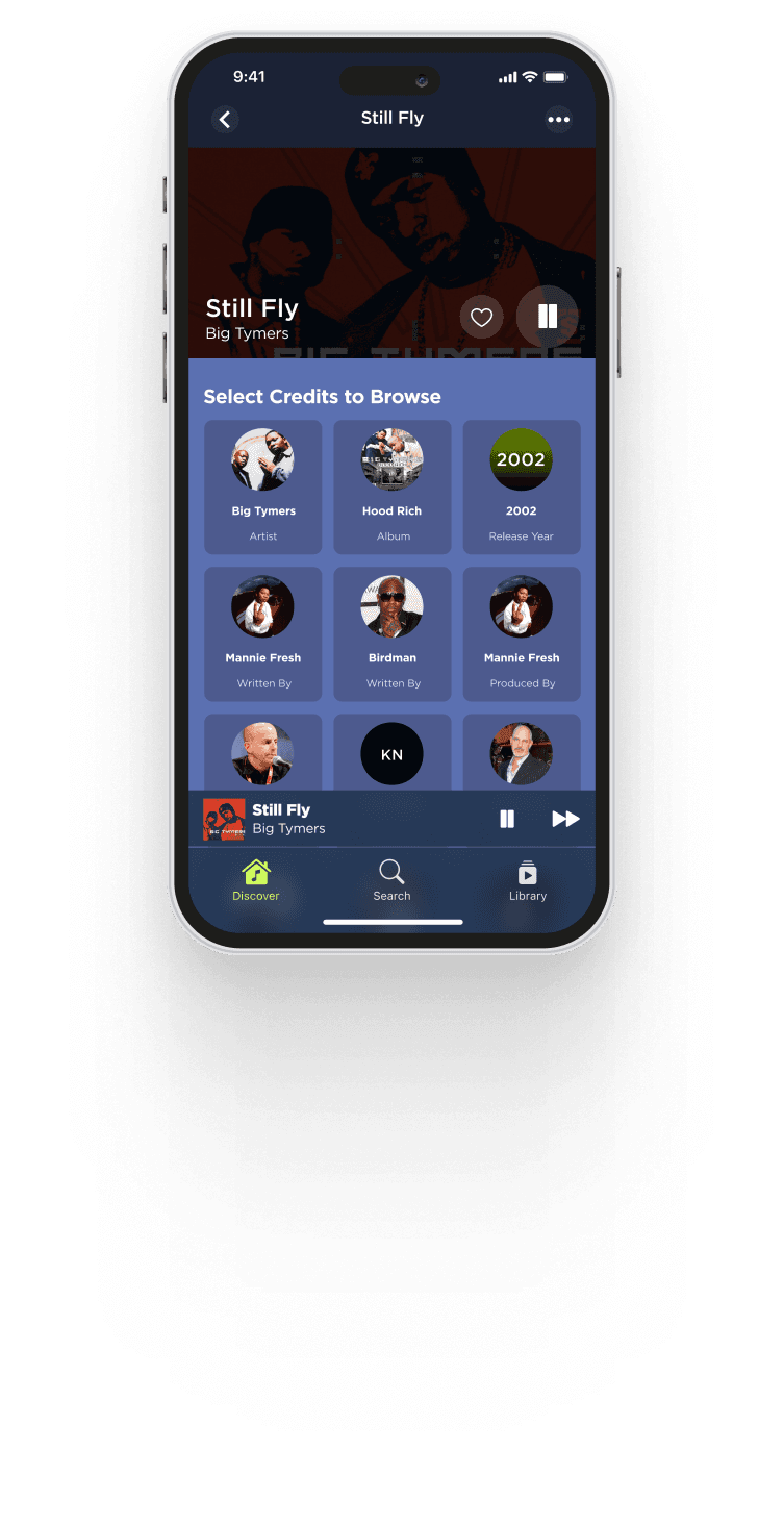
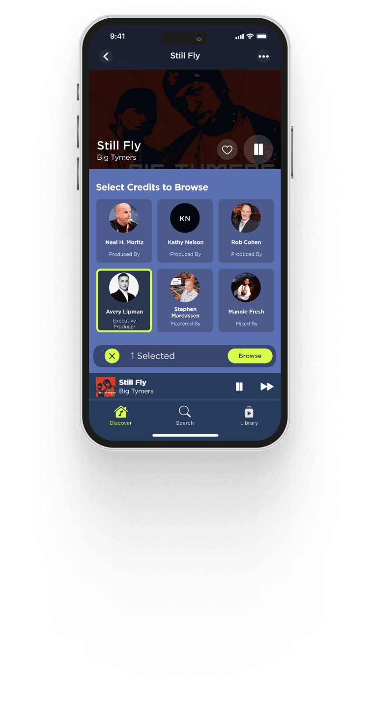
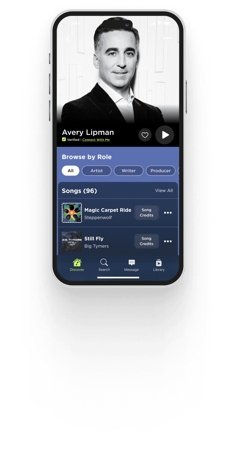
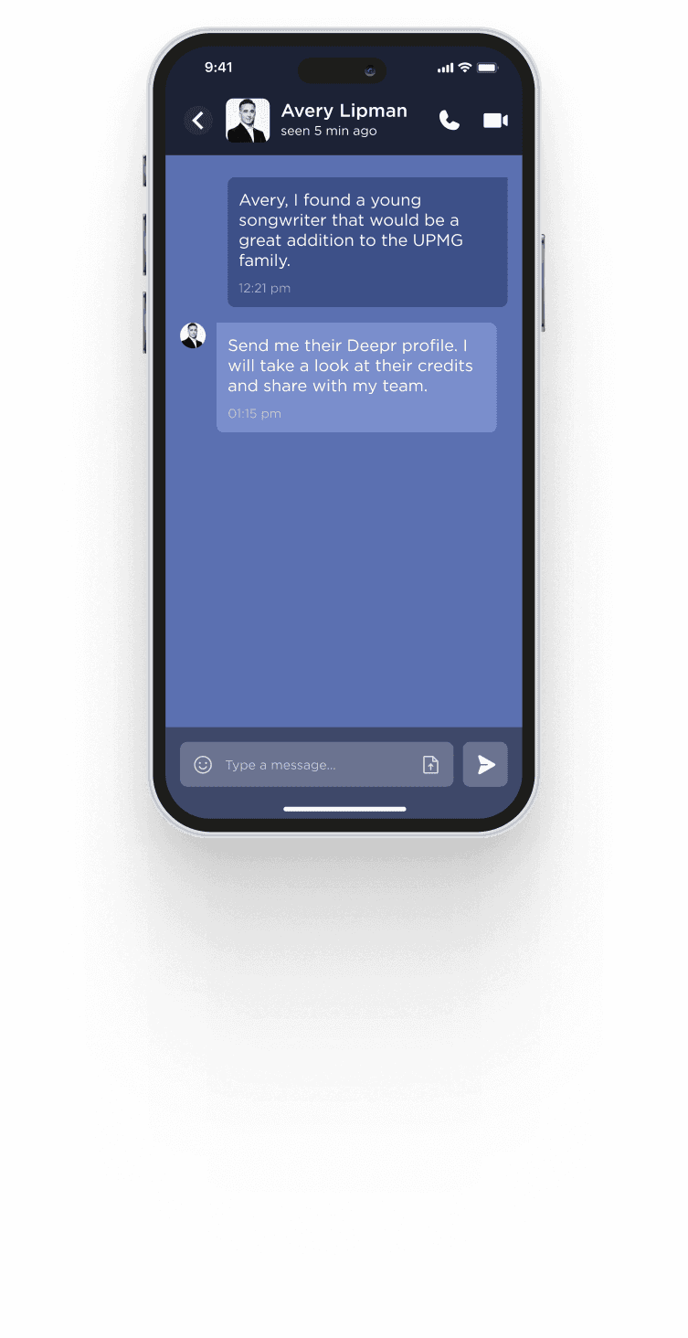
High Fidelity Connects UI flow
Key Design DecisionBrowse by role, not by wall of names
A profile like Avery Lipman's — a record label executive with 96 songs and 53 collaborators to his name — could easily become an overwhelming wall of credits. I added role filters (All, Artist, Writer, Producer) right below the profile header so the same profile serves a casual browser and a specialist trying to find every producer credit equally well.
Real-World Use CaseA&R scouting, built into the product
The messaging screens in this flow show a genuine industry use case: an executive telling a colleague "I found a young songwriter who'd be a great addition to the family," and the reply — "Send me their Deepr profile." That single exchange is the clearest proof of Deepr's value to insiders: credits aren't just historical metadata here, they're a live talent-discovery and networking layer for the music industry.
06 — Platform Integrations
Context beats consistency. Every time.
This is the design principle I'm most proud of from Deepr. When we integrated into four streaming platforms, the instinct was to create one visual language and apply it everywhere. Consistent brand identity. Same colours, same components, same layout. That's what most companies do.
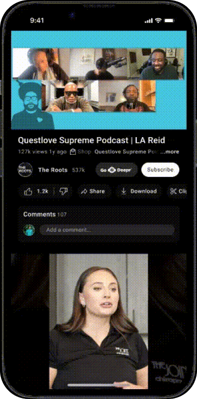
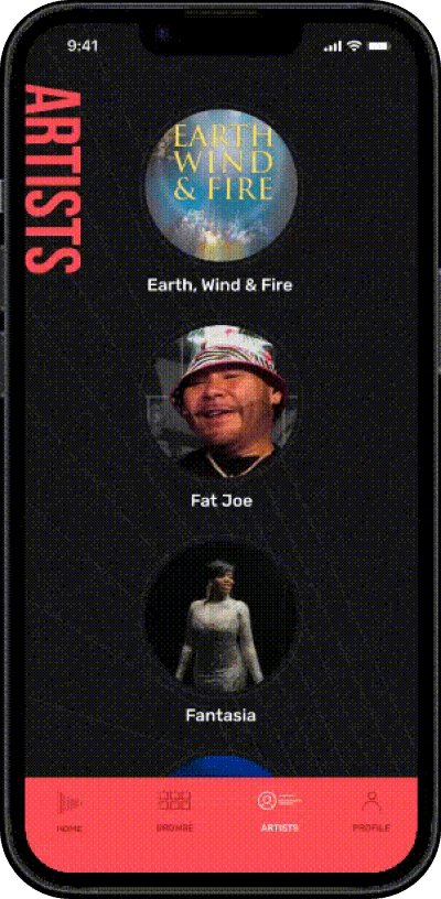
I did the opposite. Deepr takes on each platform's visual language — its colours, its spacing, its conventions — and adapts. On YouTube Music, Deepr is dark red. On YouTube, it lives inside the existing Details tab. On APEX, it's the richest experience with credits, concerts, merch, and reviews. On Amazon Music, it's the most restrained — a subtle expandable section that matches Amazon's conservative UI.
The result: Deepr never feels like a third-party plugin. It feels like a feature the platform always should have had.
YouTube Music
YouTube
Apex Music
Amazon Music
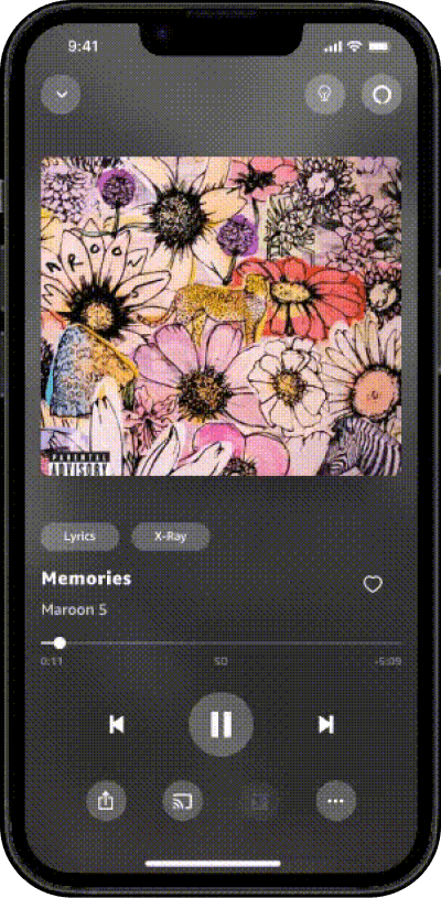
High Fidelity Prototype of 4 different platform
07 — The Why Behind the What
Three principles that defined Deepr's design.
 Core principle
Language is design
"ASCAP Publisher" → "Executive Producer." "Mix Engineer (rec.)" → "Mixed this track." The single biggest impact I had on Deepr wasn't a layout or a colour choice — it was rewriting every credit label in plain language. When the words are right, the interface barely needs to exist.
 Multi-platform strategy
Context beats consistency
Deepr looks different on every platform it touches — and that's the point. YouTube Music's dark red, Amazon's restraint, APEX's richness. The product adapts to where it lives rather than forcing brand consistency. The result: it always feels native, never alien.
 Interaction philosophy
No dead ends, ever
Every element in Deepr leads somewhere. Every credit leads to a profile. Every profile leads to a discography. Every song leads to more credits. The entire product is a web of connections. If a user hits a screen with nothing to tap, the design has failed.
08 — The Outcome
Designed end to end.
Presented across seven surfaces.
This concept work covers the full scope, from research to high-fidelity screens, across every surface Deepr's music discovery experience could touch. I designed every screen, every widget, every platform integration, and every interaction from scratch and presented them to the product team. Deepr itself is a live, real product — this case study documents the design thinking behind a body of work I did for it, not a claim that every screen shown here shipped as-is.

Surfaces designed — iOS, Netflix, YouTube TV, YTM, YouTube, APEX, Amazon

Concept — full flows & hi-fi screens, unreleased

Backers of Deepr — a16z, Google, Apple, ALLBLK

Designer — end to end, every surface, every pixel

"Deepr taught me that the hardest design problem isn't making something look good — it's making something invisible feel important enough to explore."
